The thrills and the spills of Formula One are just around the corner with only two weeks to go until the first race of the 2023 season in Bahrain.
But the teams have got tongues wagging this month with the much-anticipated car launches and have shone a light on their new car liveries.
Car launches can be quite tedious and boring to watch with some teams opting to drag out their show and interview all the team and the sponsors before revealing the car, but in some cases, teams just give fans what they want to see.
This year, we had a range of different launches from Haas revealing their car on social media, to a drawn-out Aston Martin launch and a Ferrari launch where they took the car out on track in front of a live audience.
All of the cars have now been launched and we have rated each car’s livery for the upcoming season.
Haas
In their seventh season in Formula One, Haas opted to change their design from last year, and in fact, is one of the most changed cars on the grid.
Haas started last season with a car that resembled the Russian flag, but once Nikita Mazepin was removed from the team amidst the war between Russia and Ukraine, the Haas quickly reverted back to a car that was predominantly white and red.
So here it is, the #VF23 livery, the first of our title-partnership with @MoneyGram #HaasF1 #MoneyGramDrivesYou pic.twitter.com/RGyeUZXDbP
— MoneyGram Haas F1 Team (@HaasF1Team) January 31, 2023
This year black has become the primary colour, this may be partly because of their new sponsor Moneygram, but also partly due to helping make the car lighter with less paint, this becomes a theme throughout.
Overall, I think the design is really nice. It is simplistic and the black and white colour combination is a safe option, but one that works really well.
However, I do think the side view of the car is better than the front view.
Rating – 8/10
Red Bull
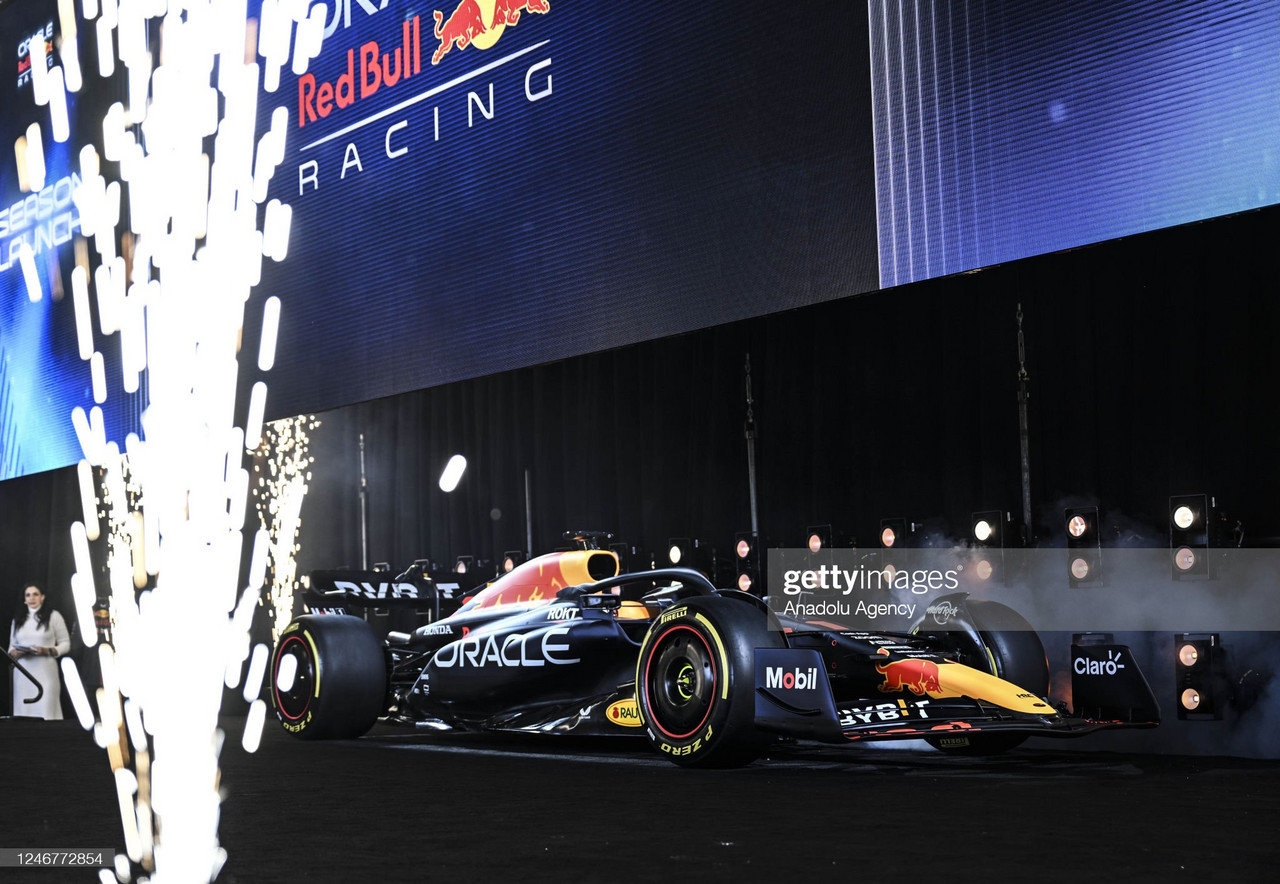
The 2022 constructor champions have produced a car that on the track will likely challenge again for the championship.
Although the design is almost identical to the championship-winning car, it is an iconic design. There is no need for Red Bull to change anything.
However, they are one of the only cars on the grid with a car that is fully painted. There are no areas of carbon.
Meet the #RB19 🤘 Our car for the 2023 #F1 season 💪 pic.twitter.com/ilCfMQMxW4
— Oracle Red Bull Racing (@redbullracing) February 3, 2023
I suspect that if Red Bull are slower than their rivals, we may see some of that paint scratched off in an attempt to make their car quicker.
The Red Bull design as it is every year is a really smart design, however, after seeing concepts of a slick navy and gold design for the constructor champions, I was a little disappointed.
Rating – 7/10
Williams
Williams changed to this all-blue look last season, after transitioning from white as a primary colour.
Again, there is not much difference between the FW44 last year, and the FW45 this year.
The car has changed from a metallic look to a matte finish, said to give a stronger on-track visual.
Ready for the journey. Introducing the FW45 💙#WeAreWilliams
— Williams Racing (@WilliamsRacing) February 6, 2023
But the biggest design difference and the most intriguing is the Duracell sponsor on the airbox, while it may not be to everyone’s taste, it is a really smart way of getting a sponsor onto the car.
It is a striking design and if you are a Williams fan you will be able to easily spot this on track somewhere near the back of the field.
Rating – 6/10
Alfa Romeo
Now, this caught my eye. Alfa Romeo have completely removed the white from last year’s C42.
Black and red are now the main colours and it looks really polished. The black and the red almost fade into each other and their new Stake sponsorship does not dominate the design.
This is #F1 2023, @alfaromeof1 style. #GetCloser pic.twitter.com/N17W8UJfB0
— Alfa Romeo F1 Team Stake (@alfaromeof1) February 7, 2023
What I would say is the car could be similar to the Ferrari on track, however, I do not expect them to be close to each other on many occasions.
One of the best-looking cars from behind, with Alfa Romeo painted across the Italian flag.
Rating – 8/10
AlphaTauri
I think AlphaTauri have had one of the better liveries in the previous years with a really simple navy and white design, and the team logo incorporated nicely.
But this is a step back. The Orlen sponsorship is too dominant, the bright red makes it the first thing you see on the car, which Orlen probably love.
take it in from all angles, the new AT04 has arrived! 🤙 pic.twitter.com/Dw1eC0lueH
— Scuderia AlphaTauri (@AlphaTauriF1) February 11, 2023
The car has almost become navy, white, and red. It reminds me of the French flag, and for a team that prides itself on fashion, this does not hit the mark.
Rating – 5/10
Mclaren
This is practically the 2022 Mclaren car with a little more carbon and a bit more Google sponsorship to it.
While the Google wheels trims are a bit Marmite, I think they remain one of the smartest bits of sponsorship integration on the grid, much like the Duracell battery on the Williams.
McLaren fans, your #MCL60. 🔥 pic.twitter.com/F6YxuSSUUL
— McLaren (@McLarenF1) February 13, 2023
Like some of the other cars on the grid, I suspect that if Mclaren are not going quick enough some of the paint should be scratched off, and if they do, they should start with the blue, as I just don’t understand how they think that orange and blue work together.
Rating – 5/10
Aston Martin
Aston Martin replaced one legend with another legend for this season, recruiting Fernando Alonso to replace the former world champion Sebastian Vettel, who has now retired from Formula One.
The product of our passion.#AMR23 #NewEnergy pic.twitter.com/CpBWjjtT7T
— Aston Martin Aramco Cognizant F1 Team (@AstonMartinF1) February 13, 2023
The Spaniard will be driving alongside Lance Stroll in an Aston Martin that has had a slight colour change, from a deeper, darker green to a slightly bluer hue of racing green.
The car also has the striking yellow/lime strip down the side, which is a nice detail, although they have toned down the neon colours slightly from last year.
I think the way they have hidden the carbon in the crevices of the car is well done, and overall, I think it’s a really smart-looking car.
Rating – 8/10
Ferrari
The Tifosi will be hoping that they can mount more of a challenge on Verstappen this year after a promising start crumbled away, with big strategy problems and car failures.
The new Ferrari adopts a brighter red compared to the deeper red of last year, and it looks like a traditional Ferrari.
The Ferrari on the wing is a nice touch, however, it is slightly odd how there is no sponsor here, but I like it.
The product of our passion.#AMR23 #NewEnergy pic.twitter.com/CpBWjjtT7T
— Aston Martin Aramco Cognizant F1 Team (@AstonMartinF1) February 13, 2023
But the one thing that lets this car down for me is the carbon cutout around the CEVA sponsor on the side of the car. There is a black box that cuts into the red which looks really clunky and spoils the side view of the car. It would be better off just being all red, so it loses marks here.
Rating – 7/10
Mercedes
Mercedes struggled last season after the drama of the season before. The car was not quick enough, and they suffered from porpoising issues causing the car to be very bumpy.
But they will be hoping this year’s car is just as good as it looks because the livery design is beautiful.
After a year-long move back to the silver, Mercedes have transitioned back to an all-black car, and I think it is the best-looking car on the grid this year.
The Silver Arrows have been accused of just saving weight by going all black, as it is now mostly carbon, but the way it has been done is really nice. It looks slick, polished, and stunning.
The product of our passion.#AMR23 #NewEnergy pic.twitter.com/CpBWjjtT7T
— Aston Martin Aramco Cognizant F1 Team (@AstonMartinF1) February 13, 2023
Some people have been critical in saying it just looks like a black car with stickers on it, but I think they have done it in a really smart way.
I like the stripe of mint against the black I think that stands out really well.
It remains to be seen whether it’s the best car on track, but it definitely wins the VAVEL award for best livery.
Rating – 9/10
Alpine
We are going to have to break this into two. Alpine have announced two liveries. An all-pink livery for the first three races, and an Alpine blue and pink livery for the rest of the season.
The pink one is by far the better car. The pink works really nicely with the black towards the rear of the car, and it is a really striking livery that will stand out on track.
The same cannot be said for the blue and pink car.
The blue and pink one is a bit of a mess, I get why they want the Alpine blue, but it just does not work and looks really ugly.
Here we have it everyone, the A523 🤩 #Alpine #A523 #F1 pic.twitter.com/8tK8qvecdA
— BWT Alpine F1 Team (@AlpineF1Team) February 16, 2023
I will really miss the pink livery after the first three races in Bahrain, Saudi Arabia, and Australia and really wish they stuck with the pink car for the rest of the season.
Rating – 8/10 (Pink), 4/10 (Blue and Pink)


