


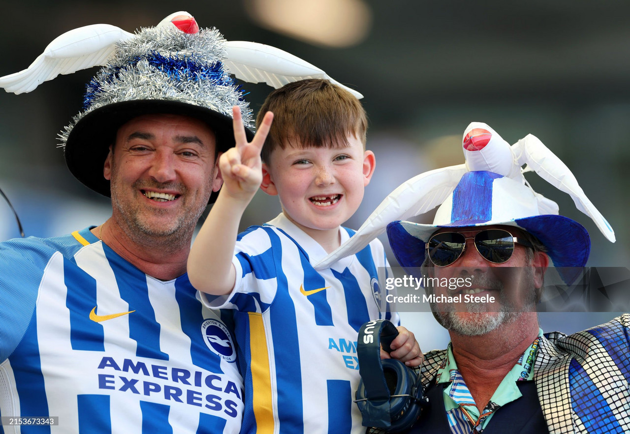

Brighton and Hove Albion have officially unveiled their highly anticipated home kit for the 2024/5 season.
The kit, released on Monday at 12pm BST, was the perfect Euros hangover cure for Albion fans. The new strip, always the most exciting start of any season, was perhaps tactically released by the club, allowing fans to take their minds off of England’s defeat on Sunday night and re-focus their attention on the excitement of the upcoming Premier League season.
The kit, lavishly styled by London fashion brand Percival, was modeled valiantly by both men’s and women’s star players alike. João Pedro, Carlos Baleba, Maisie Symonds and Vicky Losada, to name a few, took a break from the training pitch and channeled their inner vogue.
This is yet another contemporary shift amongst kit manufacturers to market new strips as fashionable, everyday wear rather than just sporting attire.
The new design, created in collaboration with Nike, is the 10th home kit released under the manufacturer. The phrase “more stripes, more style” has been used by the club upon its release, in reference to the pin-stripes dividing the traditional blue and white decorating the front.
The first impressions from fans are proving the “more style” claim correct. Some Twitter users claimed it to be an ‘all timer’, with others suggesting it was the ‘Best shirt in the Premier League era.’
With 2024-25 rumoured to be the last season of Nike’s manufacturing contract with the club, there is no better time to reflect on the evolution of Brighton's home kits since their promotion to the Premier League in the 2017/18 season.
The Albion's All-Time Premier League Kit Rankings:
8th Place: 2023/24 Season
In a list of beautiful kits, this is perhaps an exception.
A contemporary design with thinner stripes and a unique gradient effect, it did create a rather modern aesthetic.
Coined “new dawn, new adventures”, the strip marked Albion’s first season in the Europa League.
Sadly, whilst there were “new adventures” on the pitch, these didn’t translate to the design of the kit.
A rather simple V-neck shirt with the off-centered stripes annoying many fans, it feels Nike could have done something very memorable with this design in an historic season.
Sadly, here, the phrase ‘playing it safe’ comes to mind.
7th Place: 2018/2019 Season
Perhaps harsh to find this design so low in the rankings, but such is the nature when a high number of quality kits have been produced.
This kit returned to much wider stripes with a lighter blue color, accented by a simple white collar, back and sleeve trim. It features the red Nike swoosh and red numbers on the back, as well as Sussex By The Sea detailing on the collar, which many supporters were admirers of.
The red on the kit pays homage to the red detailing that was a primary feature on Albion kits throughout the 1980s and ‘90s. So, why so low? At the time, it felt almost like a carbon copy of the promotion kit of 2016/17, and therefore there was no need to purchase it.
Call it laziness by designers, or question perhaps how different you can really make striped kits of the same colourway; either way, it is 7th.
6th Place: 2019/2020 Season
4th Place: 2017/2018 Season
The first-ever Brighton & Hove Albion Premier League strip. A memorable one, with high expectations.
There is no doubt that Nike delivered. In many ways similar to both the strips before it in the ranking, with yellow detailing on the swoosh, a subtle V-neck and nicely spaced bold blue and white stripes.
The thin striping detail of the sleeves are also certainly a unique and suave design.
However, it's not the kit alone that means it ranks this high, but instead the nostalgia attached to it.
It's the childish excitement of Anthony Knockaert unveiling the club’s first Premier League kit at the promotion party, the joy of Pascal Gross netting Albion’s first goal, and the pride of those two home wins Manchester United and Arsenal that really make this a special kit for so many.
3rd Place: 2020/2021 Season
A bolder kit by Nike that was certainly welcomed and loved by Albion fans. So much so, that placing it third may even prove controversial.
The white pinstripes on the blue background is a nod to Brighton’s FA Cup Final kit of 1983, sponsored by Phoenix Brewery.
That is a famous and popular kit amongst supporters, and this kit without doubt did it justice. The addition of the yellow features, once more popular, and the white collar gave this shirt a very smart feel.
More than anything, this shirt, out of all of them, looked good both on the players but more importantly on your average fan, with a pair of jeans and a pie in hand in the stands.
Sadly, Covid prevented this reality for most of the season, but if anything the uniqueness of the Covid season was the perfect marriage to the distinctiveness of the strip. Unlucky perhaps to only receive a bronze medal in this ranking system.
2nd Place: 2024/2025 Season
Call it recency bias if you will, but I really feel Nike have smashed it this year.
A lot of white is great on a Brighton kit, and the inter-stripe pin-stripes of this year's design, matched by the white sleeves, swoosh and back certainly gives that.
It feels like a revitalising design in an exciting time for Brighton fans.
Off the back of a frustrating, injury-plagued season, this design captures the fresh feeling amongst fans looking to the new season equipped with a new young coach, as well as a flurry of promising ‘big-money’ signings.
Upon asking the kit connoisseurs at the Albion Obsessed Podcast, they said: “It's a solid 8/10…and if it had included stripes on the sleeves it would have been an instant classic.”
High praise indeed, from a group who know what they’re talking about when it comes to kits.
1st Place: 2022/2023 Season
Not traditionally a huge fans favourite, especially when it first got leaked via a photo of a trading card circulating Twitter.
Whilst it grew on most fans, for me this is one of the best Albion kits of all time.
Again, this is a brilliant example of yellow detailing to accompany the blue and white. This kit delivers it with a smart yellow crew-neck collar, swoosh and accompanying sleeves.
The cherry on the cake is the thin yellow stripe through the centre of the thick, bold blue and white stripes. This is the perfect blend of a remarkably clean kit, imposing in its design, yet unique among other strips.
Its success in design was matched perfectly by the Seagulls’ performances on the pitch that season; an important criterion in how any kit is remembered. That season, Brighton reached an all-time high 6th place and qualified automatically for European football for the first time in the club's history.
The Albion performances, maybe for the first time, were at the forefront of British and global media platforms, and what better kit to be wearing whilst doing so.