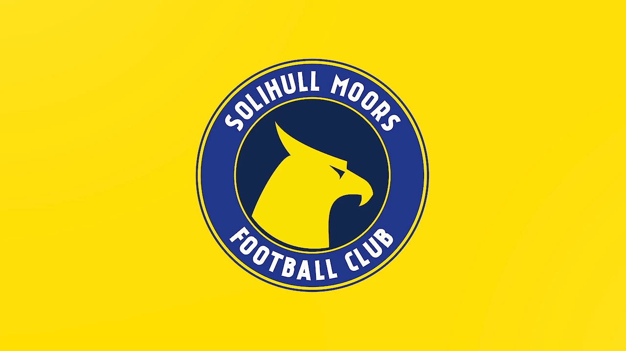
Ahead of the clubs 2022/2023 kit launch, National League side Solihull Moors have unveiled a new club identity and football fans across the community, have not taken to it vert well.
The Backstory Of Solihull Moors
Solihull Moors have only been a professional football club since 2007. This was following the merger of local side Solihull Borough and Moor Green.
Since the merger, Solihull Moors have remained in a position, where they still pay tribute to their routes. This is shown in the former badge, which is almost identical to the former Moor Green FC logo. Also, every season the club rotates their away strip, to mimic their former clubs. It's either red and white for Solihull Borough or sky blue and royal blue for Moor Green.
Why The New Badge?
The new badge was designed by the club, in association with Solihull based company CM Brand. The design has completely ditched the old style and replaced it with a more modern, rounded version. It's very similar to the old Torquay United logo or the current Dorking Wanderers badge.
The new badge is the clubs attempt to move away from it's former routes, and reestablish themselves within the community as well as nationally. The logo represents Solihull Moors, whilst the former badge represents the history of the two former clubs that make up the current one.
Why The Griffin?
The biggest question that was asked by many supporters, is what the Griffin in the clubs new badge (above) represents.
The Griffin is taken directly from Solihull’s Coat of Arms. It’s taken from the arms of the Finch Family who hold several lordships in the Bickenhill & Meriden area. The Griffin symbolises Solihull Moors latest core values which are; strength, military and courage.
How Could It Be Improved?
The new Solihull Moors designed badge is a very modern take and is something that a lot of sides are switching to in recent seasons. However, the badge looks very basic and that is a big problem. For a football team to switch a badge, it needs to be justified by the story and the design and Solihull’s isn’t.
The badge consists of two circles with the words ‘Solihull Moors Football Club’ in it, is pretty standard and that isn’t the issue here. The actual issue is that the design of the ‘Griffin’ is too basic. It’s just plain yellow with no inside design.
The badge I wanted to compare this to is Dorking Wanderers and this is because their design is very similar, except the inside of the circle has a pattern and a unique design instead of a basic animal. It makes the badge seem very simplistic, as though their has been no serious effort which has angered a lot of fans.
Is A New Badge, The Right Next Step?
A lot of clubs switch up their badge designs in order to make their club more recognisable, and that’s definitely the case for Solihull Moors. The current badge represents the past history of Solihull Borough and Moor Green rather than the newly founded club Solihull Moors.
Therefore, the hierarchy wanting to make their logo more associated with Solihull Moors is definitely an idea that fans can get behind, however the design has got to justify this and not be a worse version.
With no comment from the football club, we can expect to see the new badge remain in place and that will bring disappointment to fans who were in love with the old badge. However, if the new badge is edited slightly, there is a higher possibility that fans could switch their thoughts and get behind the newer version but time will tell.


